360° Holistic Design Vision
for Brainly.
”Graphite Dust”.
Project rationale
Project setup
Project timeline
Project execution
Delivery acceleration
Key decisions
Decision validation
Cross-functional stakeholders
Project impact
Mistakes made
Lessons learned
Approach revision
To face Brainly’s challenges found in Customer Journey Map research, and build foundations for the strategy for the next three years, The Graphite Dust project aimed to improve Brainly's user experience by incorporating design guidelines for brand, product, and marketing from Design System Pencil and expanding them with brand heroes. Brainly, the biggest worldwide peer-to-peer online learning platform used by over 350 mln students, faced a decrease in design quality due to its rapid growth and influx of new designers. Our team led by example towards implementing standards established at the Brainly Design Center of Excellence. “Building trust” was the cornerstone of the project on many levels - building the trust of Brainly customers, building the trust of our design system users (Brainly designers), and building the trust of the Brainly leadership in our ability to improve design quality in the time of teams hyper-growth.
The Team. The project was my initiative. I led a group of design leads, merging their cross-functional expertise into one coherent design vision for the Brainly user experience. The team comprised Senior Brand Designer, Senior Motion Designer, Lead IxD Product Designer, and Lead UX Motion Designer. I was the owner of the initiative responsible for making it happen (keeping in mind Brainly values - Deliver with Quality, Strive for Better, Stay Curious, Lend a Hand, Lead by Example), making critical decisions for design and delivery, structuring communication, and ensuring long-term impact.
What did we do? To combine perspectives of all 4 functions of design we worked together from brainstormings through mockups and the prototypes with defined areas of responsibilities. The outputs consisted of:
Hi Fidelity prototypes, including changes in selected Key Touch-points of the product:
Asker/Answerer Flow (web)
Registration Flow (web)
Question Page (web)
Splash screen (app)
Home page/screen (app)
Video tutorial for using the Snap to Solve function (app)
Hero Section of the Home Page (unlogged users - web)
New Brand Heroes' aka Product Heroes characteristics and illustrations used in the prototypes and ready to be used in Product and Marketing.
Unmoderated user research on User Zoom
Communication with stakeholders and the rest of the company
Project rationale
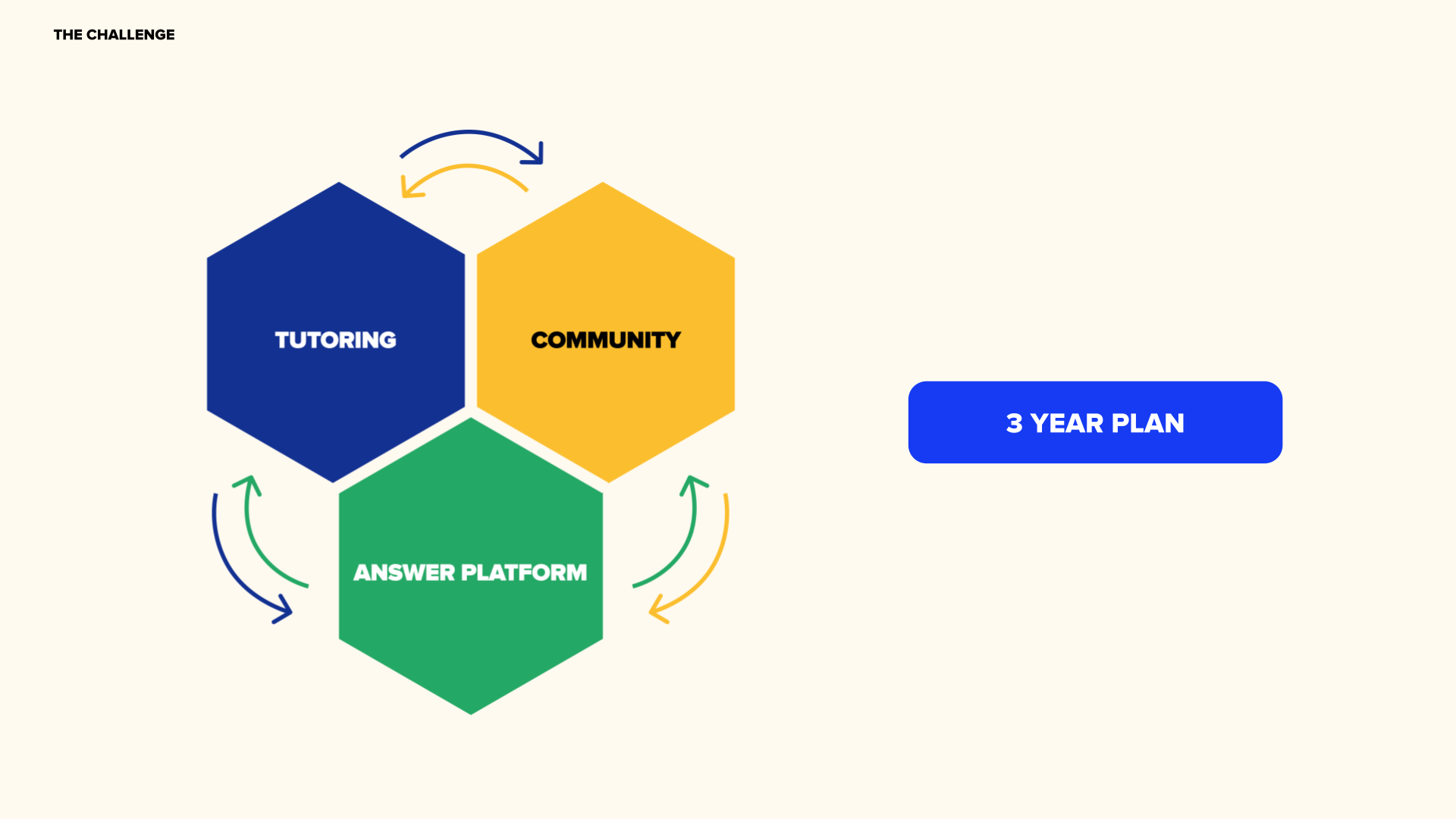
The challenge. As the Design Center of Excellence and the Design Systems and Foundations team, we must focus on delivering Brainly's three-year plan by building a faster and easier help platform and an extremely engaged community. However, according to Brainly's Customer Journey Research, our current user journey is full of abandonment moments, and nothing retains users as we would like to. Research findings show that our customers have only a “transactional relationship” with Brainly.
The assumption. To achieve our business goals faster, we should build meaningful relationships and an engaged community. We should start by understanding who our users are. We need to know not only their "jobs to be done" but also their reality and point of view to better solve their problems, communicate, and relate. We can address that in many ways, but engaging brand, clean interaction design, guiding ux motion, delightful animation, and visual design could be our contribution to addressing that.
Risks. In this type of initiative, the main risk was that our design vision would not be well received by students, who are our customers. The second risk was internal, as getting buy-in for a higher level of experience in a data-driven company is challenging, as we often focused on short-term goals and low-hanging fruits. At the same time, it was also one of the reasons the product's design was suboptimal. To address that, I’ve used internal and external research, got user feedback before presenting the vision to the stakeholders, and put a special effort into compellingly communicating the project to build the trust we needed from the organization.

Project setup
Set up of the project. As the vision demanded, we worked in a cross-functional group of senior and lead designers. The collaboration was remote, so we used Slack, virtual meets, and collaborative tools like Miro, and Figma plus Jira, and ProductBoard. We started from the project kick-off and collaborative session when I led the group to align on the initiative goals, success criteria, deliverables for the team, and individually, the framework for collaboration, and the timeline. I prepared a miro board with the following steps of the agenda and links to related Brainly research that was already available. Everyone also collected benchmarks and inspiration on their dedicated boards. We used this board later in the process whenever we needed to hold a brainstorming session, collect references, or update the deliverables or timeline collaboratively. These sessions were essential as they allowed for new ideas to be generated, and everyone on the team felt they had a voice and an opportunity to contribute.
I went with the team through the SMART success criteria defining exercise to give us alignment, confidence, and motivation.
SPECIFIC What do you want to accomplish?
MEASURABLE How will you know when you have accomplished your goal?
ATTAINABLE How can the goal be accomplished?
RELEVANT Is the goal worthwhile? Will it meet your short- and long-term needs?
This translated to the definition of an Objective on our Product Board.
Primary success criteria: User feedback from GenZ users aligned with the initiative's goals. Buy-in from the leadership. Inspire designers across the company to use new directions proposed by a team. Green light for additions to the design system (in product, brand, and marketing sections next year). High adoption rate by the Product Designers with impact on retention, engagement, customer satisfaction, and revenue.
Secondary success criteria: Convince product stakeholders to test or implement the changes in a more extensive experiment. As the project is aimed at creating foundations of experience and leading the team by example, this is not our primary goal.
Metrics to consider during the process:
Unregister user: conversion to registration
Register user: conversion to trials, without impacting conversion to content creation
Trial user: conversion to subscription
Subscribed user: engagement (we should not think about content creation)
During the kick-off, we also aimed for “measures” like “a jaw-dropping experience,” as there is nothing less motivating than meetings full of soulless jargon. This one became our unofficial success criteria.


Project timeline, execution & delivery acceleration
Building Trust: Most of all, I led the team using my authentic style with humor, transparency, and vulnerability. My experience shows me that those are the best ingredients to build trust in teamwork. I worked with the team to estimate the time required for each task to establish the project timeline. Together we created a list of milestones and a Gantt chart to ensure realistic scope and program. I also considered any potential risks that could delay the project and built in extra time to mitigate those risks. I communicated the timeline and milestones on the ProductBoard to the rest of the company and updated them regularly on progress.
Questioning Assumptions: My team, like me, is often questioning assumptions, so at first, I was leading through doubts, as that was the first initiative done by this cross-functional team. But when the vision started to come up to the light, everybody was sure this would be one of the best projects we ever did. We executed against the project timeline by working in 2-week sprints and holding regular standup meetings to ensure everyone was on track. We also prioritized work based on feedback and our capacity in given sprints and established a process for incorporating changes into the delivery plan.
Validating Direction: To stay on track, we set up a process for reviewing progress at critical milestones and during sprint reviews. We used JIRA and ProductBoard to track progress and ensure we met our deadlines during bi-weekly planning.
To accelerate delivery, I leveraged agile methodologies. I also prioritized tasks based on their impact on the project's success and streamlined our processes wherever possible to minimize delays and roadblocks.

Key decisions
To ensure that my decisions were validated and based on solid data, I relied on user research and feedback. I also worked closely with our UX Research Manager to analyze user data and gain insights into user behavior.
Validating Direction: Besides Customer Journey research and other research studies done by Brainly in the past, we used our creativity, knowledge of best practices, and desk research to validate our solutions' direction.
Building Trust: By consistently showing that our decisions were based on data and user feedback, I established credibility and built trust with my team and cross-functional stakeholders.
Questioning Assumptions: I continually challenged my assumptions and those of my team in frequent feedback sessions and by seeking out feedback from users by testing our assumptions through research. By questioning assumptions and being open to new ideas and perspectives, we were able to refine our approach and ensure that we were on the right track.
In this project, we were also evangelizing, going even beyond science into emotional design. From psychology, we know you can’t have a meaningful relationship without a personality. To build a meaningful relationship with our customers and an engaged community, we must make our product legit, real, fun, and clever, as our brand personality describes. To achieve this, we must go beyond science and leverage art, as former product leaders at Stripe, Twitter, Yahoo, and Google - Shreyas Doshi advises. We used those “pushing the envelope” ideas to build trust.
I used research studies about the impact of aesthetics, creativity, and Gen Z (our target audience), done by academics and industry leaders.
I used reports like:
”Customer journey research” by Brainly
”Motivations, rewards & references in-depth study“ by Brainly
”What are users impressions of the Brainly app” by Brainly
“The Elements of Value. Measuring—and delivering—what consumers really want” by Bain & Company
“Experience Economy” by Joe Pine
”For Gen Z, Brand Is What You Share, Not What You Sell” by Ogilvy
“How Do People Evaluate a Web Site’s Credibility?” by Persuasive Technology Lab Stanford University
”Predicting Users’ First Impressions of Website Aesthetics With a Quantification of Perceived Visual Complexity and Colorfulness” by Harvard University, University of Colorado, University of Maryland College Park
“Assessing dimensions of perceived visual aesthetics of websites” by Talia Lavie, Noam Tractinsky


Decision validation
What insights did we use to validate the direction? We decided to focus on building relationship with users through engaging brand, clean interaction design, guiding ux motion, delightful animation, and visual design. To validate this direction, we leveraged our own, as well as prominent and less-known studies by acclaimed researchers. For example, the very well-documented phenomenon of the Aesthetic Usability Effect. The aesthetically pleasing design creates a positive response in people's brains and leads to personal relationships with a product, evoking feelings of affection, loyalty, and patience. This, in turn, catalyzes users' creative thinking and problem-solving while interacting with a product, impacting metrics such as engagement, retention, and customer satisfaction. That was the base of our approach, but we also used other learnings, for example:
Typical factors that block students from effective learning. Students struggle with noisy and turbulent environments, negative or lack of peer communication, "I am bad at this/ I don't understand this", Lack of personalization, Feedback on the finish line, uninterrupted heads down time, the teachers that are not didactic or dull.
Students are missing Learning through play and fun in educational struggle.
For Gen Z, uniquely (compared to previous generations) describe creativity as essential and see as a core attribute of daily life.
Users establish a lasting opinion about a website’s appeal within a split second of seeing it for the first time. Predicting the aesthetic appeal of a website can have enormous economic implications for online consumer-vendor relationships. Quantitative models for predicting users’ first impressions of aesthetic qualities can be developed based on perceptual models of visual complexity and colorfulness in websites. The prediction of colorfulness and complexity models can account for nearly half of the variance in the observed visual appeal ratings. Visual complexity is more important than colorfulness in users' first impressions of appeal at first sight. Age, gender, and education level all influence users' first impressions of websites, with even stronger tendency to prefer simpler designs by study participants above 45
In a study conducted by the Stanford Web Credibility Project, Half of all consumers (or 46.1%) assessed the credibility of sites based in part on the appeal of the overall visual design of a site, including layout, typography, font size and color schemes. For context, less than 10% of comments referred to the site's identity or its operator. Nearly 7% of consumers commented about a site's customer service or related policies when assessing credibility. Nearly 3% of consumer comments referred to a site's sponsorships when assessing credibility, whether perceived as positive or negative in nature. People mentioned privacy policies in less than 1% of their comments. Comments about correcting false or misleading information were not found. Participants seemed to make their credibility-based decisions about the people or organization behind the site based on the site's overall visual appeal.
Successful products deliver functional but also emotional, life-changing, and social impact aspects of value. The more elements of value provided the greater customer loyalty, the higher sustained revenue growth, or willingness to try a particular brand. Across all industries, the perceived quality value affects customer advocacy more than any other element.


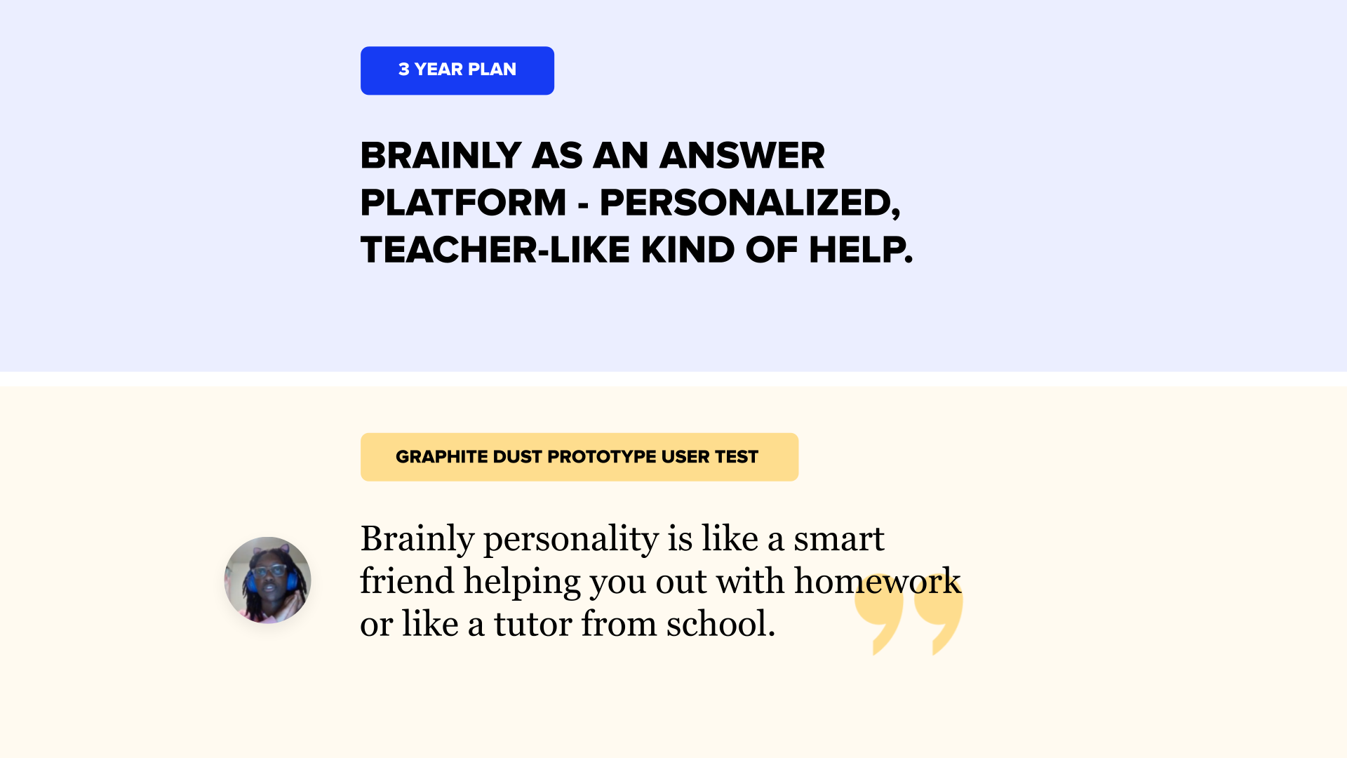
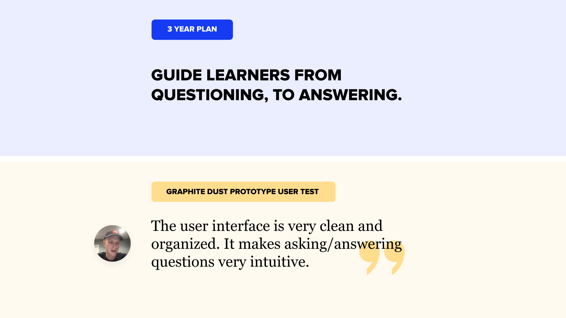
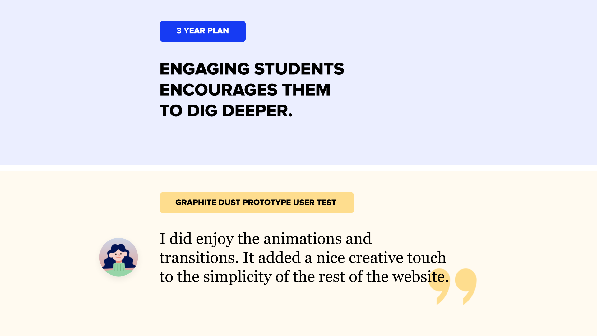
How did we validate the design? We were confident about that initiative after conducting user tests with fifteen GenZ participants aged 18-22 from the US on User Zoom. We aimed to get thirty sessions, but a little hiccup with User Zoom Credits that just ended destroyed our plan for quantitative research, so we rested with qualitative. We get excellent user feedback for the prototypes with just minor tweaks to adjust in the design. Later we connected with 3-year plan goals, as seen in the attached images.
But we could also notice that users appreciate higher quality. This was not the first time we have heard from users that the use of handmade illustrations and animations
is perceived as made by professionals, which is projected to other aspects of the product, and results in trustworthiness to spend time and money with us as the aesthetic usability effect defines.
Users also enjoyed the animations and transitions. As It added a nice creative touch to the simplicity of the rest of the website. So the combination we were after was noticed
and worked!
We also included a survey to check how the design performs against Brainly Brand Personality traits. The results showed that we were on the right track.


Cross-functional stakeholders
I recognize the importance of cross-functional collaboration in the success of the project. This initiative was focused on design, but the team itself was cross-functional, and I see this merger as a base for its success. I also worked with other functions, such as communication, engineering, and product leadership, to align us on the initiative direction and navigate through changing environments. By being open to new ideas and perspectives and encouraging cross-functional collaboration, I challenged our and others’ assumptions and ensured we were all working towards the same goals.
I organized a structured feedback session with Brainly designers to validate our direction. We gathered overwhelmingly positive feedback on miro boards dedicated to questions about project areas and goals. We also received some constructive feedback that we included in the final designs.

Project impact
By leveraging user research, design thinking, and Design System Pencil, we were able to create a platform that was user-friendly, visually appealing, and reflected brand personality.
The project was a sensation and exceeded his primary success criteria, including “jaw-dropping experience.” We not only received the green light to include new elements of the system like brand aka product heroes in the Pencil. We get enthusiastic buy-in from Brainly Designers and a high adoption rate of the project ideas. The leadership was also impressed. It influenced the company's direction for the next year; our direction was cited in the CPO keynote about the 2023 product strategy at Brainly Kickoff onsite gathering.
The problems we were solving became the main objective for our team in 2023, and I became it was expanded by CX Product Design with me as a lead.
So far, our vision has been used in at least two major projects (Brainly AI Guide “Ginny”, and Marketing Videos “Panda”) that helped the company achieve its goals, resulting in increased revenue. Unfortunately, even though we received personal support from the CEO to make a redesign based on the Graphite Dust direction, it didn’t happen yet, so the secondary success criteria of convincing product stakeholders to test or implement the changes in a more extensive experiment is still waiting to happen.
By delivering a successful project meeting all its success criteria, I built trust with cross-functional stakeholders and demonstrated our team's capabilities and effectiveness.

Mistakes made, lessons learned & approach revision
One mistake we made in the project was underestimating the time and resources needed to complete the prototypes between other duties of Design Center of Excellence team members like leading other projects, support, and consulting for ongoing initiatives of multiple product teams, hirings, levelings, and Design CoE Operations initiatives. To address this, we partially delegated or deprioritized other tasks, especially at the finish line.
Lessons learned after teams started implementing the direction is establishing more strict rules or different approaches to illustrations, as we noticed over usage instead of a balanced approach that skillfully merges clean design with delightful moments.
Also, I would secure funds for user testing in advance, so we won’t have to be blocked by long budget approvals.
If allowed to approach this project again, I would reach out to C-level earlier and try to count their (uncommunicated) perspective while selecting key touchpoints to focus, and priorities. Seeking C-level input earlier would unlock the possibility of changing the approach to product design earlier. That could make the initiative even more impactful.
Additionally, I would seek out more opportunities for user research and feedback to validate our direction and ensure that we were meeting all of the success criteria.
The Graphite Dust results & influence
Graphite Dust
Foundations for Future Brainly Design
Senior Manager & Team Leader (My role)
Senior Brand Designer
Senior Motion Designer
Lead IxD Product Designer
Lead UX Motion Designer
Graphite Dust - Ginny
5% increase in CVR to subscriptions
Senior Manager & Team Leader (My role)
Senior Brand Designer
Senior Motion Designer
Lead IxD Product Designer
Lead UX Motion Designer
Product Designers
Visual Designer
Lead UI Engineer
Senior Software Engineers
Graphite Dust - Panda
1% increase in CVR to subscriptions
2,8% increase in CVR to Brainly Tutor subscriptions
Senior Manager & Team Co-leader (My role)
Communications Director & Team Co-leader
Design Operations Coordinator
Senior Brand Designer
Senior Motion Designer
Product Manager
Software Engineer
Animwood Agency